Five best practices for designing data visualizations in Power BI
From the ancient masters of rhetoric themselves, we are told that logos, or logic, is an effective way to persuade an audience. And all of recorded history is a testament to the power of storytelling, a most innate human attribute, to influence people’s actions. Therefore, being able to tell a story with logic, with data, must be an effective way to understand the world and act within it according to our goals. This is the foundation to which Microsoft’s Power BI application is based. Tell a compelling story through the visualizations of data, and that story can help inform decisions that will benefit businesses.
Data visualization is a powerful tool to leverage myriad and complex data, rendering it as a clear and digestible story that can drive better, more insightful business decisions. Power BI is a highly functional application for creating data visualizations, and paired with these five data visualization best practices, users can deliver quality, actionable insights into their business’ data.
What are data visualizations?
When unorganized or organized ineffectively, business data can be confusing, masking insight. Data must be sifted through, selected, and brought to life to see the bigger picture.
Power BI is a data visualization solution that allows businesses to connect to, model, and visualize data. Power BI is a powerful business tool that makes complex data more digestible, driving better decision making. When using this application, users can take granular data from almost any source and turn it into something easily understood, visually compelling, and useful.
Visualizations bring greater value to any context where information sharing, communicating, and collaborating occur. They can demonstrate performance/impact of any change to business or products, shows trends, uncover relationships between variables, and achieve any other analytical goal a business desires. Data visualizations in Power BI can be live dashboards, interactive reports, charts, graphs, plots, and tables, just to name a few.
Five best practices for data visualizations
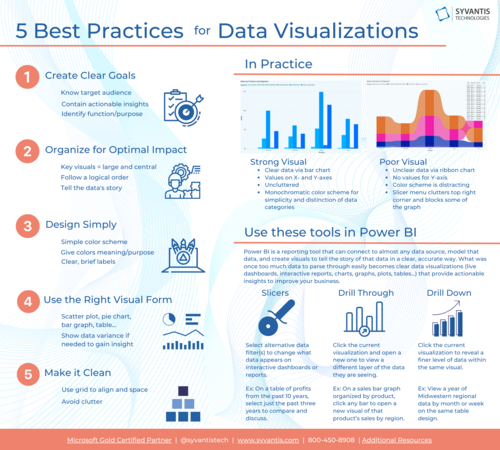
It’s important to center upon strong practices of design and data representation when working in Power BI. The app’s functionalities are vast, and it’s easy to get carried away with the robust visual design and data collection abilities and lose track of what’s most important: showing the facts in a clear way. So here are five best practices of data visualization to help guide your work in Power BI:
Clear goals
The first step to creating anything—a visualization, a budget report, etc—is to know who is going to use or see your visual and what function your visual will serve. In rhetorical terms, this is the audience and purpose of your visual, and without having these two considerations firmly established, any project will struggle to be as effective as it could be. Further, whether you are designing just one visual or several to showcase together in a report or on a dashboard, your visuals should tell the story of the data it represents. Of upmost importance is to have a clear sense of who is going to see your visual, and what you want to show them, and for what reason you want to show it—all with the ultimate goal of visualizations: to contain and produce actionable insight.
Optimal organization
Setting visuals side-by-side create contrast and reveal connections. In a series of visuals, each rely on their neighbors to reveal some insight. But ineffective organization of visual sets, like dashboards, can cause disruption and muddle comprehension. When organizing a dashboard or a series of visuals, remember that order and size of each visual matters. Key visuals should be on larger tiles and centralized, as should visuals requiring large amounts of data (which would otherwise be condensed and hard to read). Make sure your dashboard or report visualizations follow some sort of logical order in how they will be viewed that is based on the story you want to show in the visuals, such as more foundational, broad information comes first and visuals of more nuanced or detailed data follow (or the reverse, depending on what story your visuals are telling). Use grids to section visualizations and create a clear, clean, and appealing delineation between each. Evenly space rows and columns on tables and bars on graphs.
Simple designs
Power BI has a full range of design functionalities, and as fantastic as it is to have these capabilities, it’s important to know when and how to use them. Complexity for complexity’s sake can lead to confusion. When thinking about design, put yourself in the shoes of the viewer. Something may be beautiful, but is it clear? Usually, a simple color scheme is best, with colors that complement each other. Colors can function purposefully: bars on a graph can be monochromatic blue to showcase different years, or a single bar can have a light blue up to the allocated budget amount, then a darker blue to show overflow costs. If something needs to stand out, it can be a different shade or a color that varies from the main design. Clear, brief labels are best. Even though a graph may look chic without labels, or you may want to add additional information to labels to make sure there is no misunderstanding, each of these is an extreme. Striking a balance between brief and clear will allow for a cleaner look to the design while still serving the purpose of a label.
Fitting and appropriate format
Power BI boasts a lot of options for visuals, and even more can be purchased in the Appstore. With options comes the ability, and struggle, to find the perfect fit. You want to choose the best design for the data that will be presented in the visual. Not all data can be represented in a scatter plot, or a donut chart, pie chart, gauge, or graph. Each visual design is best suited to fit different data. And remember back to best practice three: even choosing the appropriate colors can be crucial to your chosen visual’s effectiveness. Further, if your data and data’s story will not be insightful without showing contrast or variance, which is often the case, make sure to show variance through another line on the graph, another column in the table, another bar on the graph. If you initiate new manufacturing and distribution processes, you cannot know if they were successful without seeing the data before and after the changes are implemented.
Clean and uncluttered
A keystone standard of design—whether it be book design, web design, interior design, or any other variety of design—is space. Human eyes need space between elements to process what they’ve seen, to understand where their eyes should travel to and from, to avoid confusion and a feeling of overwhelm. So, there shouldn’t be more on a report, dashboard, or visual than is necessary to tell the data’s story. Avoid clutter, whether it be data clutter, design clutter, word clutter, or too many visuals. As you design, reassess the overall report, dashboard, or visual. Ask yourself is this necessary? What, if anything, can I cut?
Below is a comparison of two visuals created in Power BI. The first visual does not utilize many of the best practices described above, while the second visual does.
Visualization 1: A poorly designed example of data visualization: unclear representation of data via a ribbon chart, no values for Y-axis, slicer menu clutters top right corner and blocks some of the graph, color scheme slightly distracting.
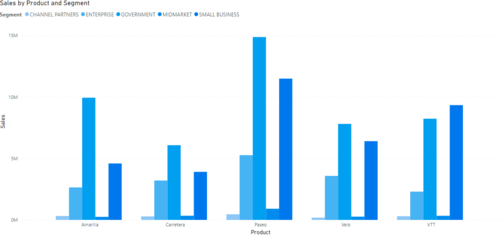
Visualization 2: A well-designed example of data visualization: clear representation of data via bar chart, values on X- and Y-axes, monochromatic color scheme for simplicity and distinction of data categories, and uncluttered.
vs
Key tools in Power BI
To achieve some of the best practices, here are a few tools within Power BI that can help:
Slicers: This function creates alternate data filter options for the visualization, dashboard, or report that a user can select and change at will. For instance, user can select any or every of the past five years to display in a visualization of a specific product’s sales in a select region. This function allows for selecting a variety of comparisons and for a cleaner look when wanting to look at just one year, or compare just two.
Drill Through: This function allows a visualization, when clicked, to send viewers to a different visualization or report, often in a new window, allowing viewers to navigate to and view a different layer of the data they are seeing in a given visual.
Drill Down: Drill Down is similar to Drill Through, allowing viewers to navigate to and view a different layer of the data in the visualization. Instead of sending viewers to a whole new report or visualization, though, Drill Down reveals a finer level of the data but on the same visual representation. For instance, a year of data can be filtered down to an individual month or week.
Using the strength of Power BI, businesses can gain insight on anything within (that is to say, everything) within their business that produces data. Data visualizations help bring life to data, telling stories to aid decision making within the business. Creating effective data visualizations is an essential skill to match with the robust strength of Power BI. So, when designing in Power BI, remember to implement clear goals, optimal organization, simple designs, the best format for the data, and avoid clutter.


